If you have visited this blog before, you will notice that the look has changed a lot. I decided that it needed more white space and a lighter look overall. I hope that you’ll like it. My only concern with the new theme, Twenty-Twelve, is that some of the text is in very small print. If this is a problem, let me know and I’ll figure out a fix.
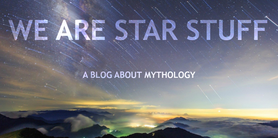
We Are Star Stuff
A blog about mythology, the stars, and the new mythology, comics.

I like the extra white space, and print size seems fine (to me). I do miss the old “blue” look, though; I seem to recall it had a blue background that seemed to fit your subject.
LikeLiked by 1 person
I like this new look. I find it is ok to read but there is something I miss. Perhaps as expressed above the soaring sense of blue sky and infinity was captured in a visual effect before. It is about content rather than background but open sky and distant stars somehow was drawing in. Cheers! and Thanks!
LikeLike
Thanks to both of you for replying – I’ve given the new look a few tweaks based on your suggestions and it does look better. Sometimes you need a fresh set of eyes (or two!).
LikeLike
I really like it. I’m writing this after you’ve made tweaks suggested by others, so I don’t see what they saw, but I’d say the changes are working. I like this blue better than the color you had before. I think it’s more inviting.
LikeLike
Thanks – I changed it first to a dark red back ground and a picture of night sky through trees that was also a lot darker. So the tweaks really lightened it up.
LikeLiked by 1 person
Love that blue!
LikeLiked by 1 person
Thanks!
LikeLike